2019 EastarJet Rebranding Case Study
Integrated Branding

Design illuminating activations around the world with us.

THANK YOU FOR YOUR REQUEST
Thank you very much for your interest in EIDETIC MARKETING.
We look forward to working with you.
We will contact you soon.Thanks Again.

THERE WAS A PROBLEM WITH YOUR SUBMISSION.
Have you checked all the required fields?
We want you to write your Company, Name, E-mail, Budget, Country to Execute, Website URL, Wanted Services and Project Description.Thanks.
Integrated Branding
Integrated Branding
Project Background
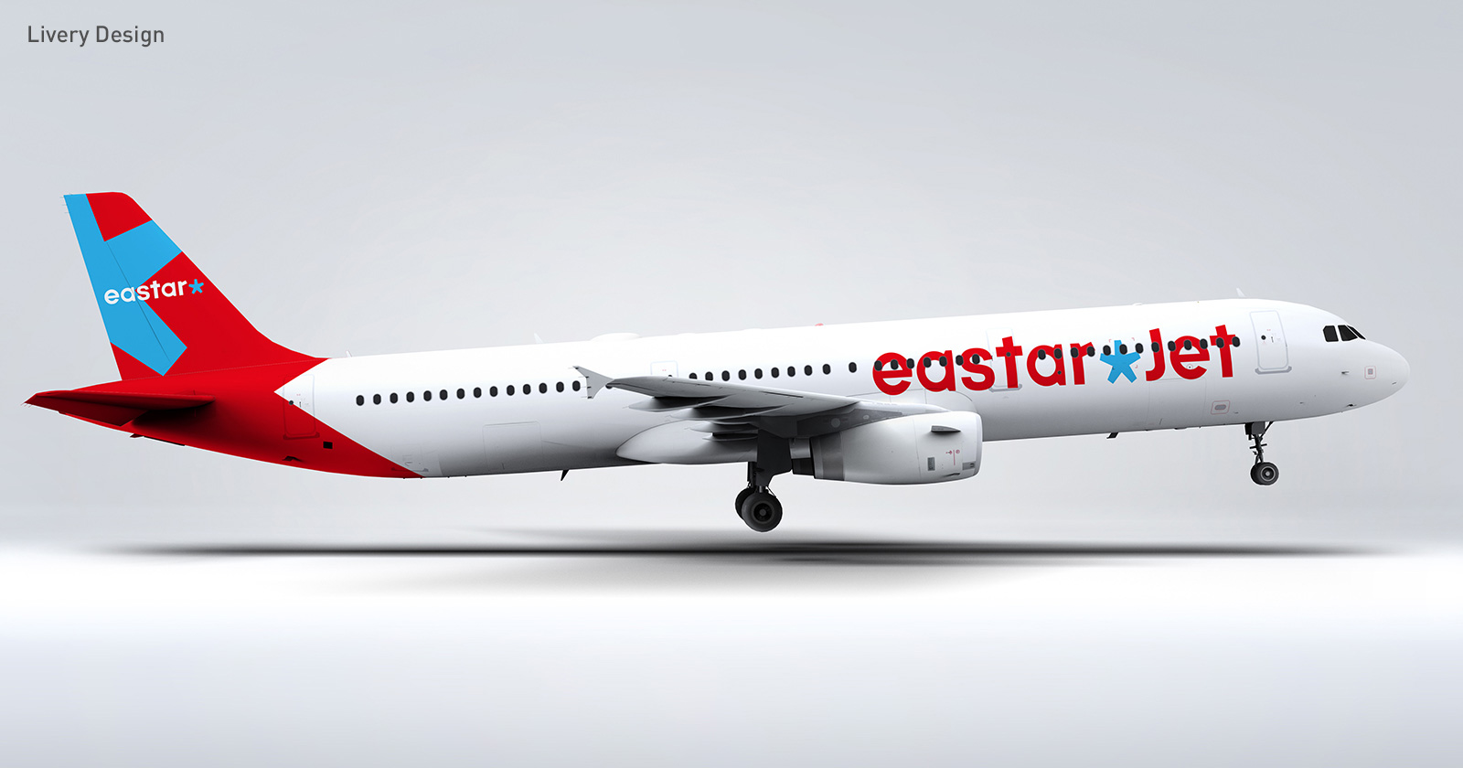
EastarJet (IATA ZE) is a Korean low cost carrier (LCC) brand founded in 2007. Based on revenue, it is ranked as the 5th largest Korean LCC. EastarJet captured the minds of its young customer demographic by offering unique services such as events in the cabin, Eastar TV, and more. As profits began to take off in 2013, EastarJet has been growing exponentially and went public in 2019. With this step forward, the need for broad scale rebranding of the EastarJet decade-old brand became increasingly apparent.Our Solution
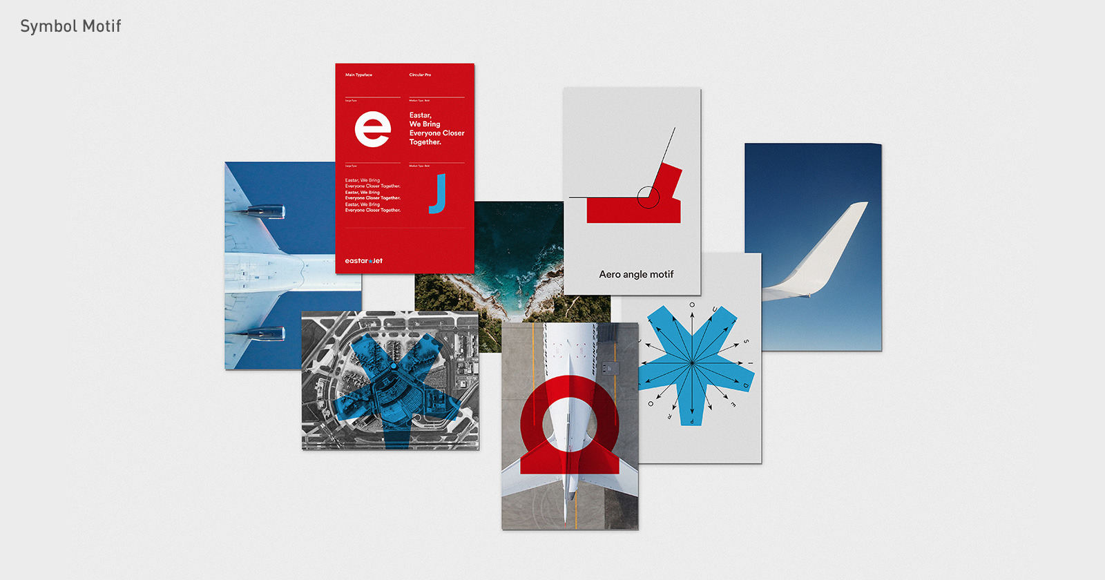
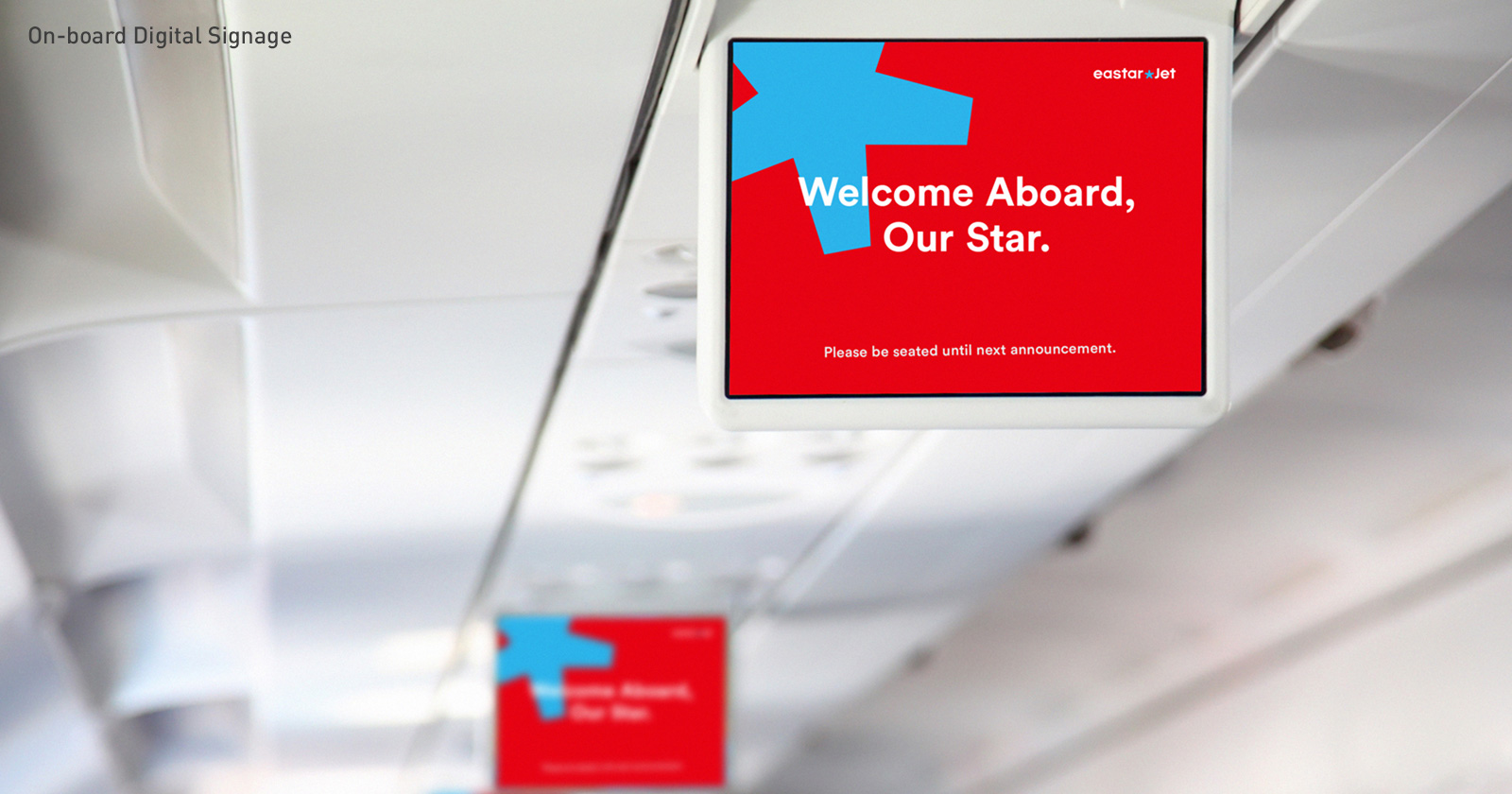
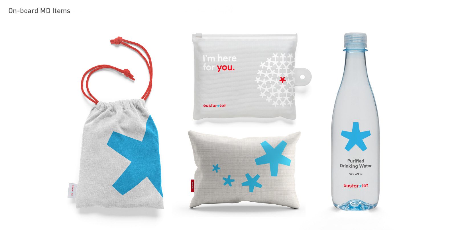
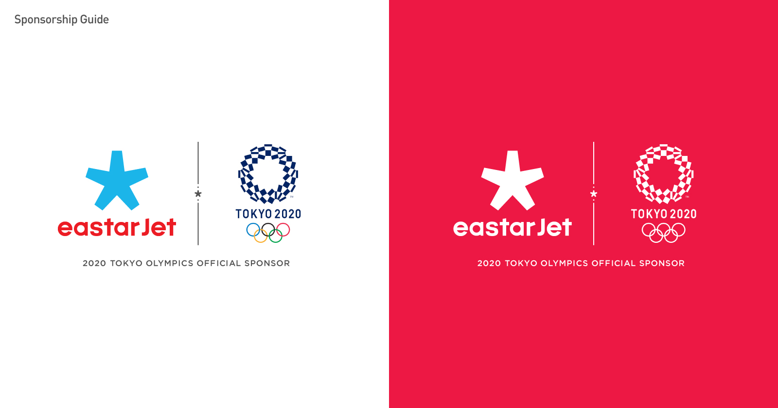
EIDETIC proposed a bold solution. The core of this project was to create an [Expandable & Flexible Brand System]. The original logo was unbalanced and out of date, it was simply not suitable for digital environments. The new logo would have to be simple & expandable, so the EastarJet brand could communicate with customers all over the world, regardless of region, about flights, airports, ticketing, and more. Furthermore, consumers are getting younger and younger, and the Millennials and generation Z consumer base were looking for a more trendy and familiar brand. EIDETIC’s newly designed brand identity was centered on the five-point star symbol. It would mark the beginning of a brand that wanted to present a new feeling with a sense of charm.