
BRIEF US!
Design illuminating activations around the world with us.

THANK YOU FOR YOUR REQUEST
Thank you very much for your interest in EIDETIC MARKETING.
We look forward to working with you.
We will contact you soon.Thanks Again.

THERE WAS A PROBLEM WITH YOUR SUBMISSION.
Have you checked all the required fields?
We want you to write your Company, Name, E-mail, Budget, Country to Execute, Website URL, Wanted Services and Project Description.Thanks.
Tag Archives: rebranding
How A Creative Branding Agency Reinvented Its Own Brand
October 31, 2024
Previous Article: Why Do Companies Rebrand? Positive vs. Responsive Rebranding
Time for a New Chapter at Eidetic
At Eidetic, we’ve developed brands across domestic and international markets, delivering memorable experiences from start to finish. Our strategic approach has earned us 19 international design awards, including the Red Dot Design Award, IF Design Award, and A’ Design Award. With our first-ever headquarters established in the vibrant Gangnam district, we’re entering a pivotal phase of our evolution.
This physical space, undergoing transformation to reflect our identity, symbolizes our growth and ambition. While the challenges of approvals and renovations are significant, they are also opportunities for us to shape a dynamic new environment that embodies our story.
Our headquarters signals more than just a physical change. It marks the beginning of our journey toward becoming a full-fledged brand consultancy. As a branding agency, we’re evolving to offer a wider range of services and expertise. Additionally, we’re establishing an in-house marketing team to provide comprehensive solutions. With these developments, we are positioned for a major leap forward. With these developments, we are positioned for a major leap forward.
How to Rebrand a Company: Choosing a New Name
What should we be called?
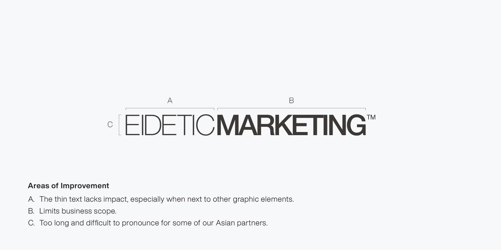
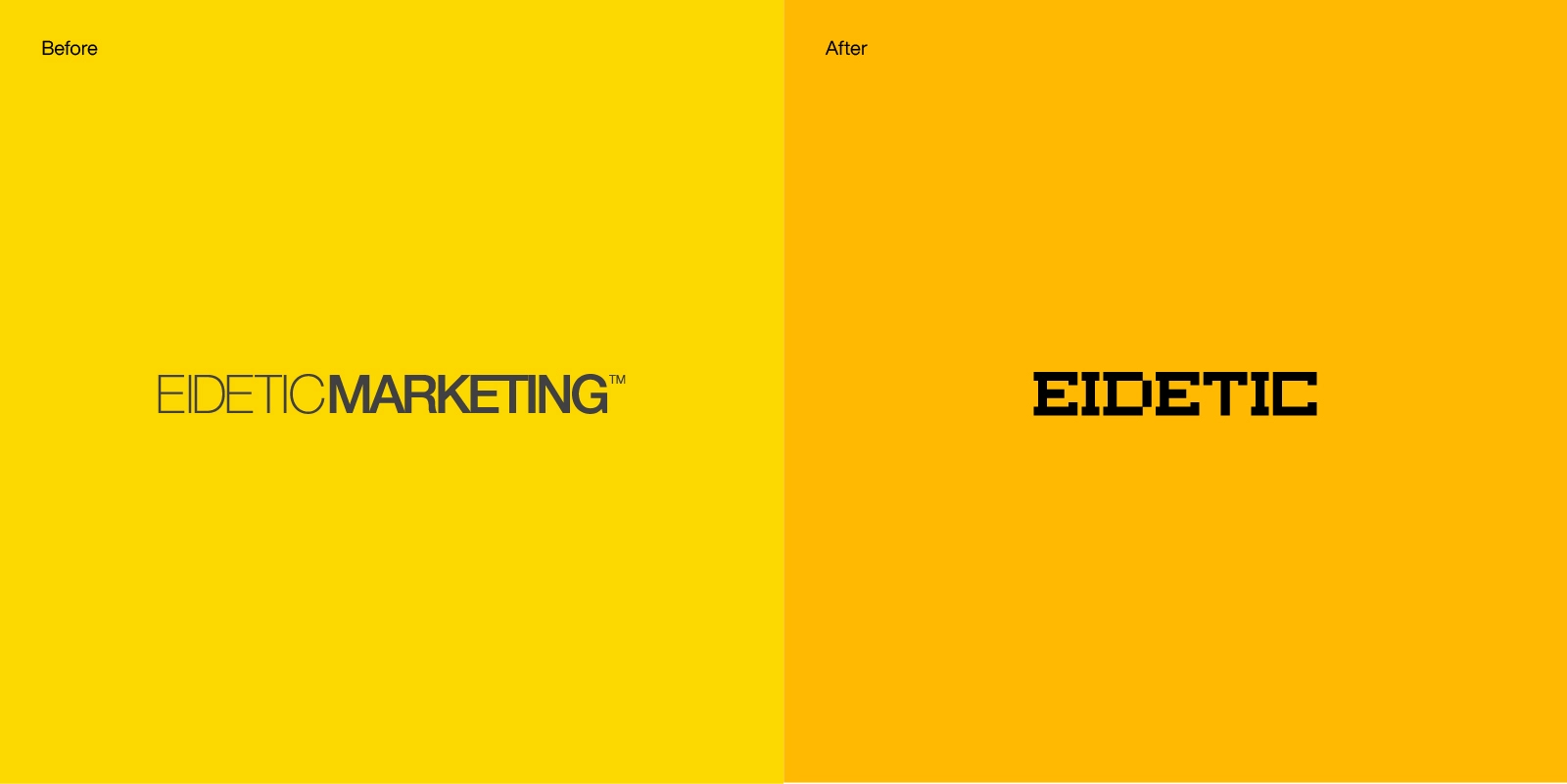
As we embarked on this rebranding journey, we knew that choosing the right name was critical. “Eidetic Marketing” had served us well but had become limiting, especially in terms of international communication. The abbreviation “EM” was frequently used due to the length and pronunciation challenges of the full name, particularly for our partners across Asia.
Naming Study for Creative Branding Agency
Through countless brainstorming sessions, we considered several options, including WASP, SPERE, HYPERS, and HECTO. WASP emerged as a top contender, symbolizing the industrious and collaborative nature of our work. It resonated with our mission to craft memorable brand experiences, much like a wasp building its hive with precision and care.
However, after careful deliberation, we recognized the value in preserving the legacy we had built under the “Eidetic” name. Rather than abandoning it, we decided to simplify our brand identity by dropping “Marketing” and focusing on “Eidetic” as the core of who we are. In the world of branding, memorability is everything, and “Eidetic” embodies our commitment to crafting unforgettable brand experiences.
Making a New Slogan
A slogan is a powerful tool for conveying a company’s identity in a concise, impactful way. While it’s impossible to explain every detail of our philosophy to every individual, a well-crafted slogan can encapsulate our brand essence.
Global consultancies like Siegel+Gale champion simplicity with slogans such as “Brilliance in Simplicity,” reinforcing the idea that simplicity often leads to success.
Mission Statement: We Build the Moment.
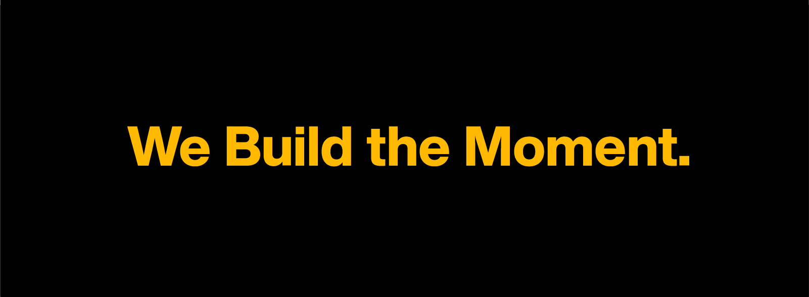
For Eidetic, our new statement, “We build the moment!” captures the heart of our mission. It speaks to our expertise in creating unforgettable brand encounters and reflects our commitment to curating moments that leave a lasting impression. This isn’t just a slogan; it’s a guiding principle that aligns with our vision for the future.
As Eidetic steps forward with renewed clarity and purpose, it remains dedicated to crafting experiences that resonate deeply—both for its clients and within its own evolving brand journey.
Rebranding Portfolio
Why Do Companies Rebrand? Positive vs. Responsive Rebranding
October 25, 2024
Why Do Companies Rebrand?
by Asia Brand Agency
Before we dive into the details, we’re excited to share that our rebranding project has been featured in the Branding category of Behance’s Graphic Design gallery. As a branding and design agency, this recognition is a true honor. We saw it as the perfect chance to reflect on our rebranding journey. It also gave us the opportunity to share our experiences of rebranding our own company.
Reinventing Ourselves After a Decade of Branding Expertise
In celebration of its 10th anniversary in 2023, Eidetic Marketing took a moment to reflect on both its past successes and its future direction. The key question, “How can we shape the future?” sparked a journey of self-reinvention, pushing us to redefine our own identity, despite years of expertise in branding for a distinguished client base.
As experts who have helped countless reputable companies build their brands, rebranding ourselves felt a bit like the cobbler’s children having no shoes—ironic, but challenging. We faced the risk of overthinking or being overly cautious. We’ve built a decade of experience, marked by both triumphs and challenges. This journey helped us realize how crucial rebranding was for us. The process allowed us to view our brand with fresh eyes. We uncovered layers that needed both understanding and growth.
Why Companies Rebrand: The Quest for a New Identity
Many companies decide to rebrand for a variety of reasons. Some undergo a complete transformation, while others make subtle changes that might go unnoticed. Even small tweaks to logos or messaging can spark significant public reaction, showing how complex and challenging rebranding can be. But what drives companies to take this step?
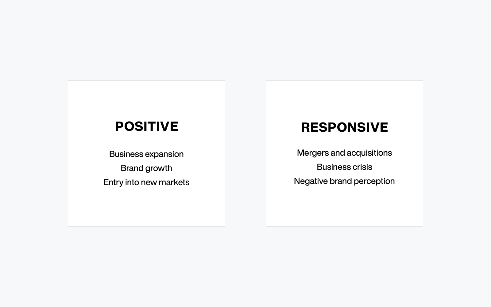
Positive vs. Responsive Rebranding
There are two main motivations for rebranding: positive and responsive. Positive rebranding happens when a company is thriving and wants to expand or enter new markets. Responsive rebranding, on the other hand, is often necessary when a company experiences mergers, acquisitions, or needs to recover from a crisis.
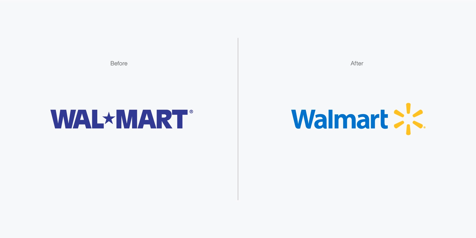
Walmart
Walmart provides an example of successful positive rebranding. Walmart, guided by Lipincott, introduced its famous Spark logo. They also updated their slogan from “Always low prices” to “Save money. Live better.” These changes were designed to reflect a more lifestyle-oriented brand.
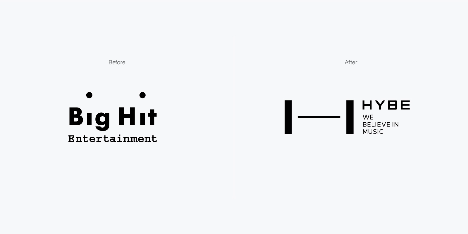
HYBE
In contrast, responsive rebranding comes into play when a company faces significant structural changes, such as mergers or crises. A prime example is Big Hit Entertainment’s transformation into HYBE. Originally known for managing BTS, HYBE expanded its scope by acquiring various entities across gaming and entertainment to become a comprehensive content platform. This shift demonstrated their ambition to diversify beyond music into new areas.
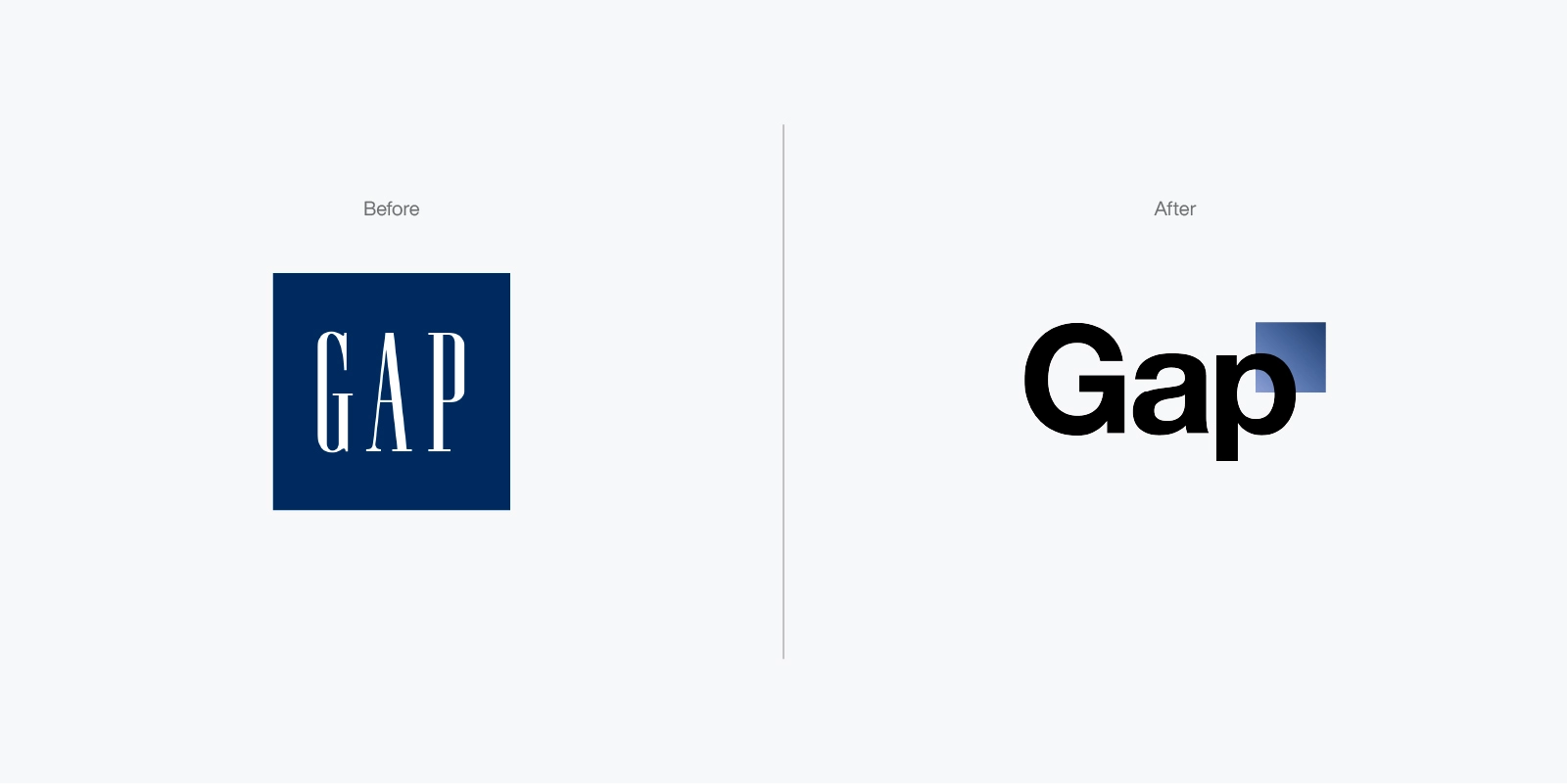
GAP & Tropicana
However, not all rebranding efforts are met with success. GAP’s failed logo redesign in 2010 is a well-known cautionary tale. Many people felt that the new logo lacked the brand’s iconic appeal and didn’t resonate with GAP’s identity, leading the company to revert to its original logo within just a week.
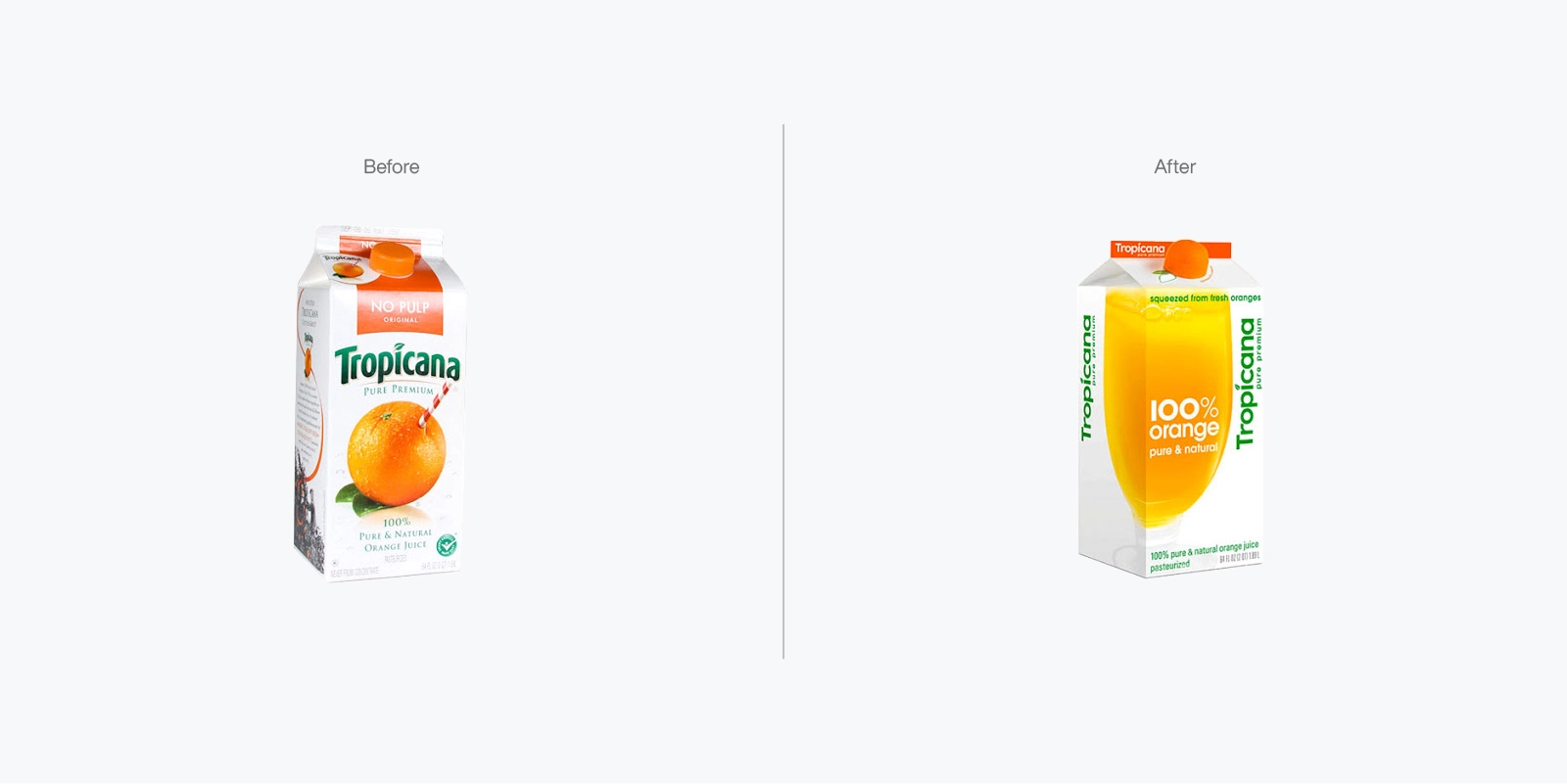
Tropicana’s packaging disaster in 2009 is another example, where the company’s drastic redesign of its juice cartons led to consumer confusion and a significant decline in sales. Both show how rebranding missteps—whether due to poor design or failing to communicate changes—can alienate loyal customers.. In just two months, Tropicana experienced a $30 million loss, forcing them to revert to their original design. The takeaway here is that visuals play a powerful role in how customers connect with a brand, and removing familiar elements can have unintended consequences.
After reflecting on why companies rebrand, from Walmart’s positive approach to GAP and Tropicana’s missteps, we realized that rebranding is more than just a visual makeover. It’s about growth, evolution, and staying relevant in an ever-changing market. For Eidetic, this brand renewal journey was not only about refining our identity but also about preparing for the next phase of our story.
And with that, we were ready for a new chapter—one that would take our company to new heights.


